CITY OF DANVILLE
BUILDING A VERSATILE VISUAL SYSTEM
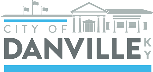
The city of Danville had several identity problems to solve at once. First and foremost, there were “Danville” logos and seals floating all over the place, but there was no distinctive visual signature to signify which organizations or communications were owned by the city government. Secondly, they had to build a visual separation between the city government and the newly rebranded Convention and Visitors Bureau. Finally, they needed a versatile system that communicated as effectively on water towers and road signage as on business cards and pens.
THE CHALLENGE
Build a visual identity that fits the city, while also being distinctive enough to stand apart from competing “Danville” logos.
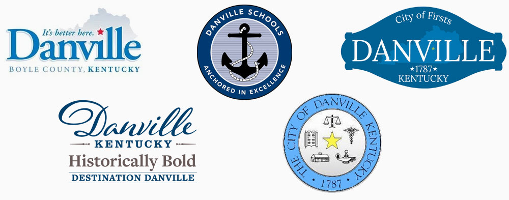
Danville Logos Everywhere
There was no shortage of logos around town with “Danville” prominently featured. While you can appreciate the civic pride, especially from businesses that aren’t officially attached to the city in any capacity, it made for a confusing situation when it came time to know who to contact about a broken water pipe or a new law up for vote.
Claiming The City
Building visual separation from dozens of similarly prominent and named organizations is difficult enough. Doing it when you have to incorporate a similar blue color scheme is especially tough. Still, solving difficult problems is what we thrive on.
THE SOLUTIONS
Utilize non-traditional blue and clean, versatile fonts, and a thoroughly planned system to separate the city’s identity.
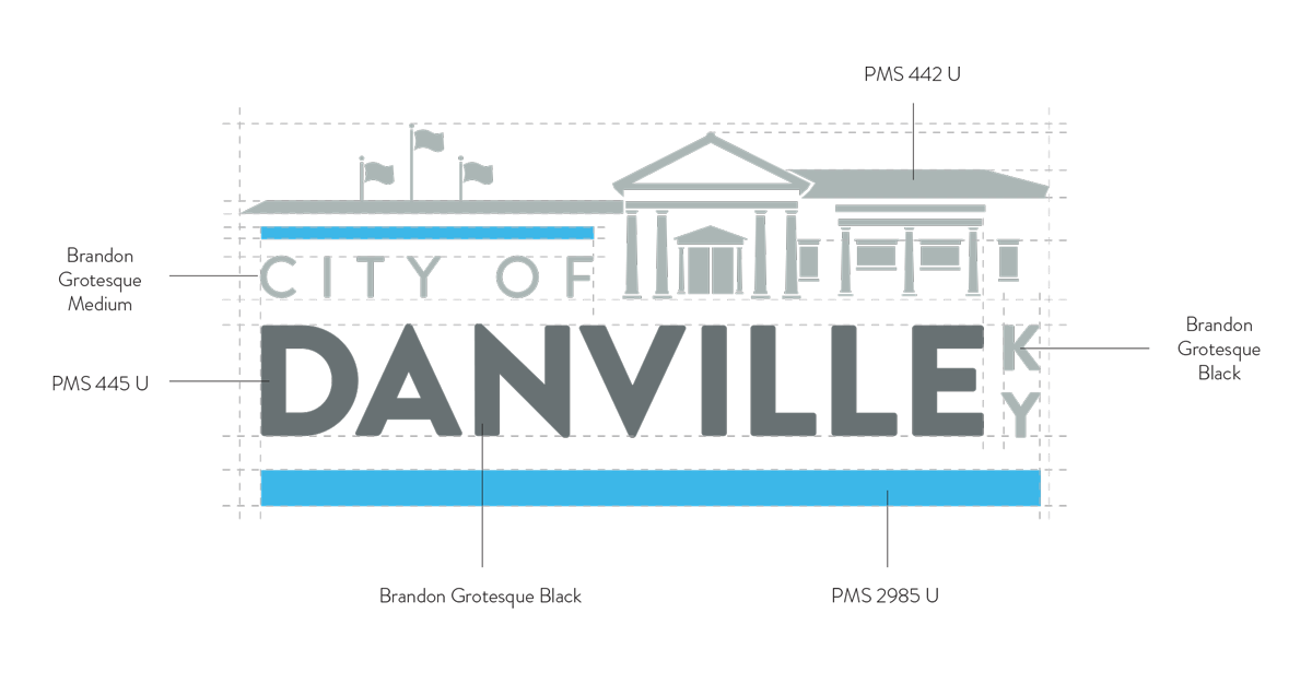
There were several important conditions for city leaders going into the project. Beyond the obvious need to build distinction, we had to use blue of some kind and we needed to reference the newly built city hall visually so locals began to associate the branding with the building that housed the officials.
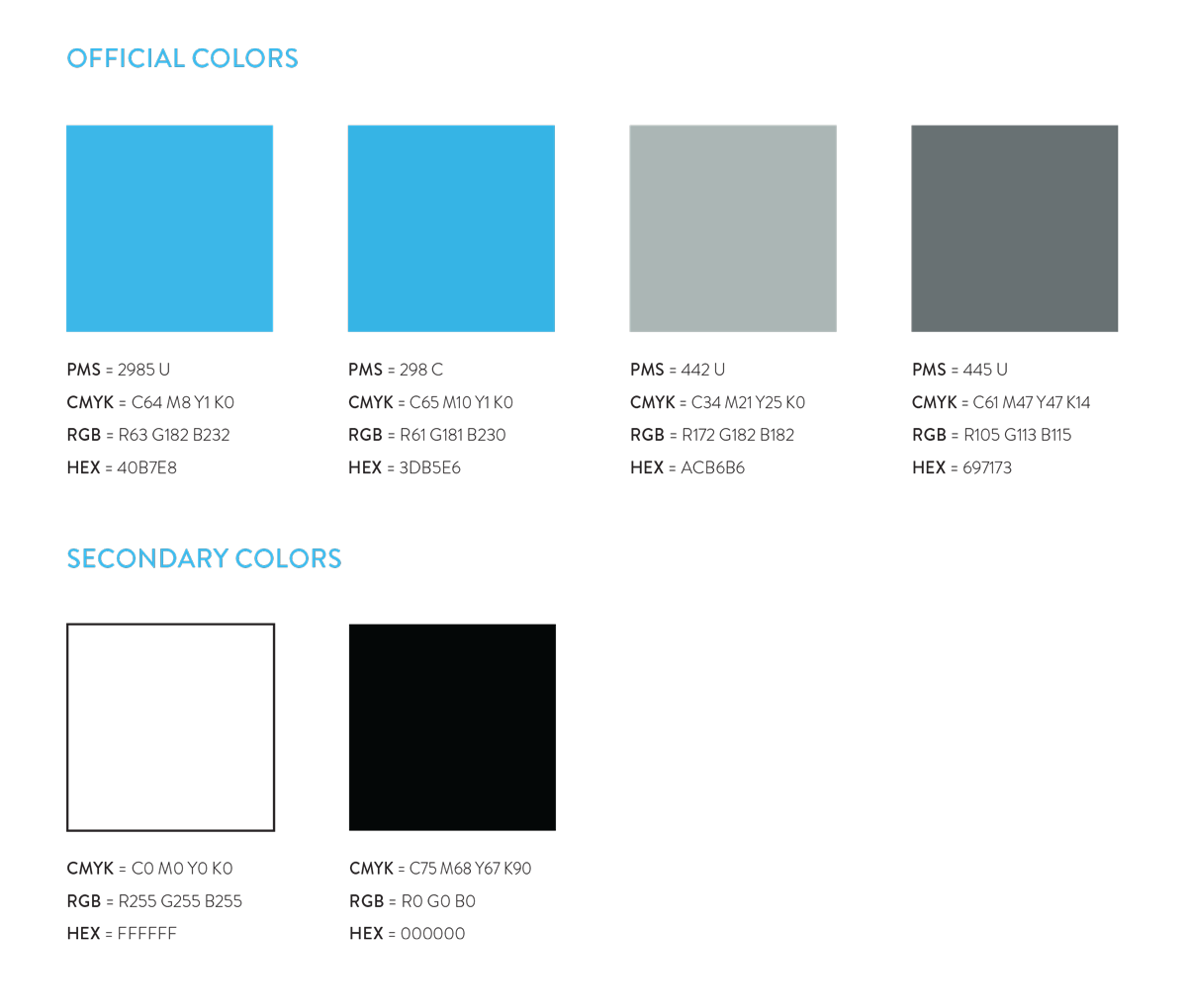
To contrast the royals and cobalts of other Danville blues, we leaned heavily into cyan. This bright blue was unlike any of those they wanted visual distinction from and it provided high visibility on signage, especially over black backgrounds.
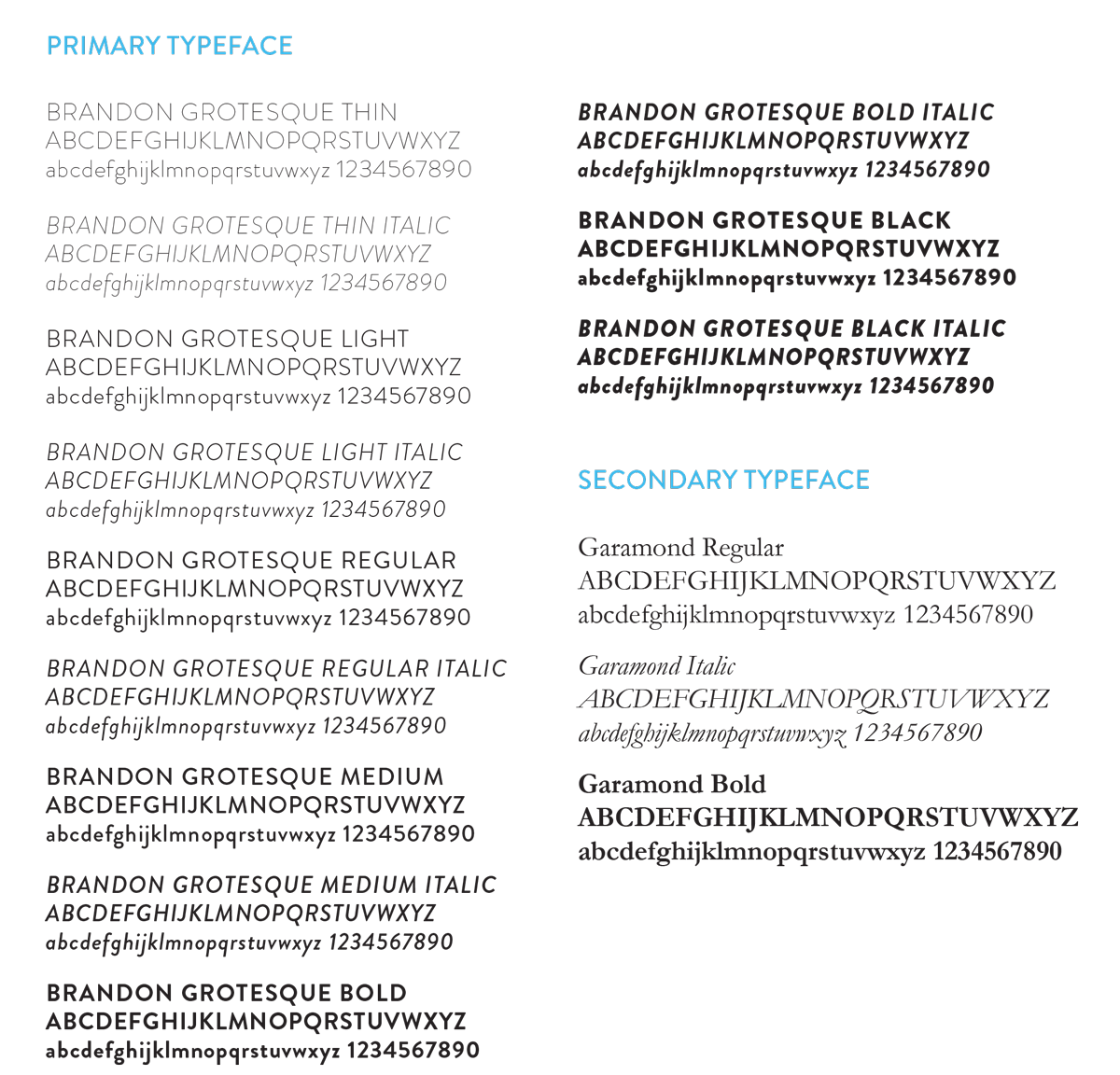
Brandon Grotesque is a sans-serif typeface characterized by its clean, geometric lines and modern yet warm aesthetic. Designed by Hannes von Döhren, it offers a blend of functionality and elegance with six weights, ranging from thin to black, each with matching italics. Its versatility makes it suitable for a wide range of applications, from print to digital media, maintaining readability and style across various contexts. The font’s timeless design ensures it complements both contemporary and classic projects. This versatility was demonstrated in its pairing with one of the great classic serifs in Garamond.
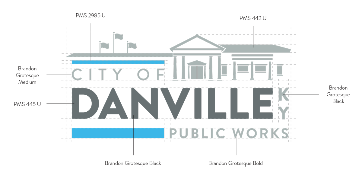
As previously mentioned, there are 12 divisions that needed specific logos for various applications for the city. This necessitated a design with flexible geometry to accommodate changes in character numbers without breaking the integrity of the design. We achieved this by incorporating an adjustable color bar below “Danville” that could be shortened or lengthened based on the space needed.

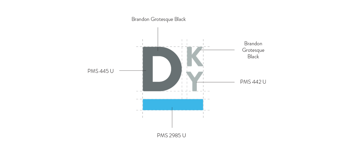
No matter how versatile you think your design is there may be applications where something simpler is called for. For those instances, we created the “DKY” mark. The mark has been used as a signature of sorts on signs and documents where a less explicit or complicated design works best.
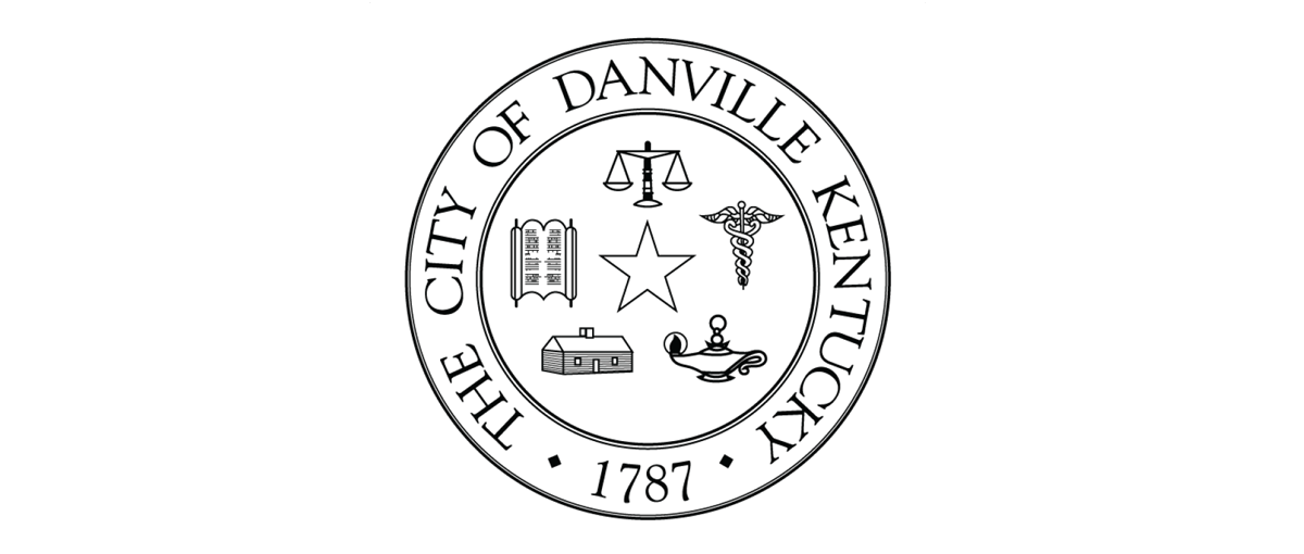
Another condition of the project was that we build a usable version of the existing city seal for applications where it is required.

