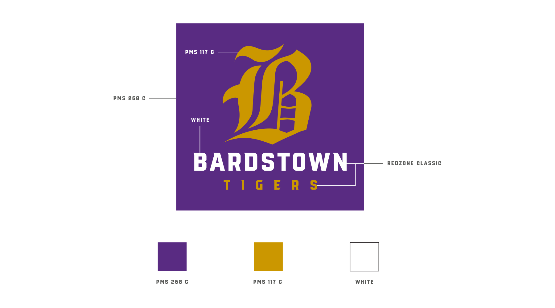
VISUAL IDENTITY: BARDSTOWN TIGERS
BUILDING VISUAL UNITY

The Bardstown Tigers had a bit of an identity crisis on their hands. While they had points of agreement in terms of name and colors, there was little else that the athletic program had chiseled in stone. There were various versions of wordmarks, “B” marks, and tiger paws floating around. In fact, the paw many were using bore an uncanny resemblance to the one used by the University of Clemson.
We were fortunate to be chosen to partner with them to establish a new visual identity that Tigers great and small could adopt and own together.
Our identity solution incorporated the existing colors for the school system, established a unified word mark, an official “B,” and a unique tiger design they could own outright.

Logos of the People
As can be the case in many school systems, a variety of folks were tasked with creating materials for the Bardstown Tigers. The PTO President might use one logo for a banner, while a t-shirt guy who owed one of the coaches a favor might use another. The majority of these folks just needed someone to provide them with the proper assets and guidance.

Setting a Standard
The vacuum that had been filled by a variety of contributors out of necessity needed to be filled by school leadership. Thankfully, the district Communications Director saw the same issues and hired us to help fill the gap and establish an official visual identity for Bardstown athletics.