THE STANFORD INN
Connecting Town, History, and Brand
The historic St. Asaph Hotel in downtown Stanford has had many names over the years. Used for a variety of purposes since its construction, it was restored to a boutique hotel in 2017 by Jess and Angela Correll as part of their Wilderness Road Guest Houses and Rooms.
In 2021, the couple decided to honor the 1918 moniker, the Stanford Hotel, by changing the name to the Stanford Inn at Wilderness Road. We were excited to partner with them in establishing a new visual identity to define the new name.
THE CHALLENGE
Honoring the past, while referencing the current spirit of hospitality revived in Stanford.

In Name Only
While the previous name referenced the historic Wilderness Road that Main Street Stanford formed adjacent to, the visual didn’t do much to reinforce the concepts beyond having a generic road shape. The overall feel is akin to a local wireless internet provider, more than a unique lodging opportunity.

Horse Country Hospitality
Hitching posts with cast iron horse heads are scattered around Stanford today as a reminder of the posts travelers would tie their horses to when visiting town. The idea is that a location that cared enough to put out cast iron hitching posts for visitors was primed and ready for visitors. Combining that concept with the Inn’s location in the Horse Capital of the World and the decision to use the hitching post imagery was a no-brainer.
THE SOLUTIONS
Combine local hospitality-related imagery with font styles similar to historic signage to create a new visual identity grounded in history.

The previously mentioned tying post image was hand-drawn in pen and ink to give it a feeling similar to etchings contemporary to the days of travel by horse in the area. The Mrs. Eaves font choice lines up favorably with the “St. Asaph” stone-engraved lettering still visible on the front of the building.

As what is meant to be the flagship entity of Wilderness Road Hospitality, it made sense to match the color scheme of the Stanford Inn with that of the parent company. The warm greys and deep golden rod accent color have been used effectively in print materials and signage.
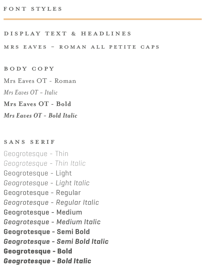
In addition to borrowing the color scheme from Wilderness Road Hospitality, the Stanford Inn also adopted their branded fonts both in the logo design and in collateral materials.

