VISUAL IDENTITY: DANVILLE SCHOOLS
Simplifying and Modernizing a Shared Identity
Danville Independent Schools has a as a storied history in Kentucky. However, like many districts across the country, it needed to consolidate locations to maximize budget funds. This change involved transitioning from three separate pre-K through grade 5 elementary schools to two schools divided by primary and intermediate grades.
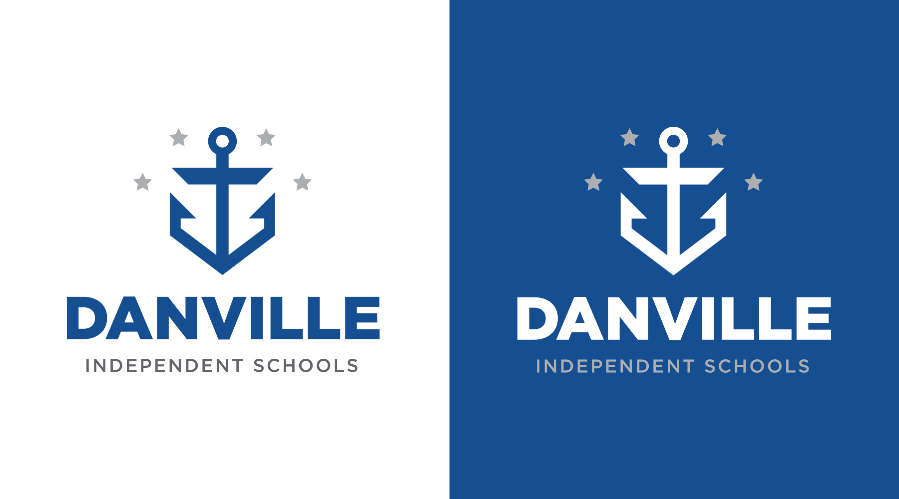
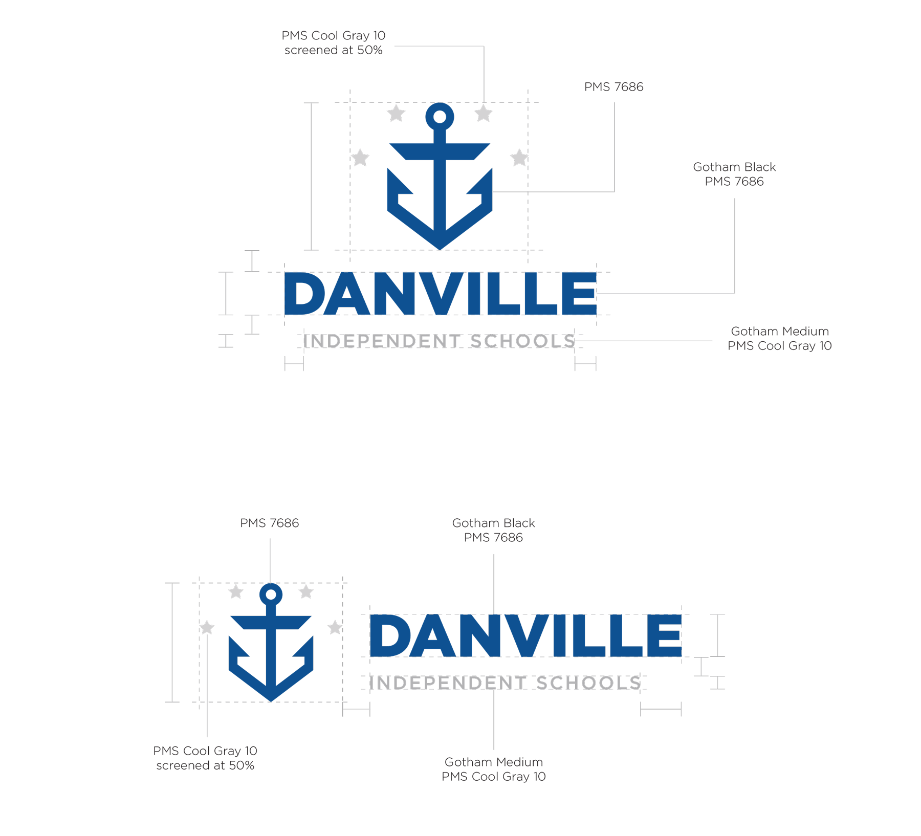
This shift presented an opportunity to examine the district’s visual identity and build unity and purpose behind the symbols representing Danville Schools. The district aimed to present a unified color scheme and font system while referencing the now four flagship facilities in their system.
We were pleased to have the opportunity to work with leadership to develop and implement their new identity system.
The identity solution was built around a unified anchor and four stars representing the four schools that made up the district.

Consolidation
Danville Schools had a lot going on visually. The district had a dated yet professional look overall, while the individual schools were more chaotic. Each school had its own color scheme, mascot, and inconsistent naming conventions.

Multi-Level System
In addition to creating a unified visual style, the district took this opportunity to standardize mascots. All schools, except John W. Bate Middle School, adopted the “Admirals” mascot with an anchor to match. The middle school’s history as an all-black school made its Bulldog mascot worth preserving. The naming conventions were also streamlined, with all schools except Danville High School expanding their names to honor the full names of local historic figures.