The Grand
Elevating the Identity of a Historic Theatre

The Grand originally opened its doors in 1925 in the small town of Lancaster, Kentucky. It was a source of entertainment and pride for the community for 30 years before closing its doors, seemingly for good.
Flash forward to more than 50 years later and after years of work and a $4.2 Million renovation, The Grand is preparing for a full season in the fall of 2024. To help prepare for the relaunch, we were asked to create a new visual identity to better reflect the aspirations of the performing arts center.
THE CHALLENGE
Create a visual identity that conveys the high-end entertainment experience The Grand aspires to.

False Starts
Relaunching the theatre has been a process to date. There have been a couple of performance seasons in the past decade, but sustainability has eluded The Grand so far. During this period, several visual identities of varying quality have been attached to their efforts.

A Better Foundation
Reviving a performance art theatre in a small rural town is no small task. While we can’t eliminate all the challenges, creating a clear and consistent visual identity is something that has not been accomplished in the past and it is a task we have gladly taken on.
THE SOLUTION
Create a visual identity that references the rich history of The Grand and conveys the market position they aspire to.

When you are dealing with a brand that has had a few iterations that haven’t necessarily been successful, any new design must signify a clean break. In this case, we decided to simplify the naming convention and go with “The Grand” instead of “The Lancaster Grand Theatre.” Beyond simplifying the naming to match local conversations, the name change also matched historic signage from 1925. Since this is one of many “Grand” theatres, it felt necessary to work the location into the primary mark. The flourish around the “G” mark is a direct reference to similar designs present in the exterior and interior of the building’s structure.

Traditionally, The Grand has been presented with a heavy emphasis on deep reds and black, with gold and white being used as accents. This matches the interior color scheme of the building. To further distance the new look from past branding, we decided to use a black analog in navy blue, went with antique gold as an accent, and decided to emphasize white as a base. The colors echo feelings of royalty/prestige and compliment the font choices and flourish design.

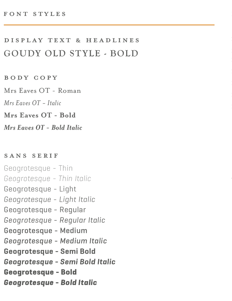
As a newly christened member of Wilderness Road Hospitality, The Grand inherits some of their corporate fonts. There are effective applications of Goudy Old Style Bold for headlines and display text, so we decided to make it available for use as well.


